Showing posts with label concept art. Show all posts

Monday, May 7, 2012

Project 3: A Cut & Sew Hat Pattern - Step 3

After, literally, hours of playing around with different configurations, I finally found the layout that would fit on one yard of 42"x36" fabric, including a lining for each hat, and still leave room for instructions.

Now that this step is finished, it's time to "fill in the blanks" and create the fabric pattern.

Tuesday, April 17, 2012

Project 3: A Cut & Sew Hat Pattern - Step 2

There's nothing like a little sleep and test-driving your ideas with paper to make you see design flaws and find easier ways to do things.  The bridge of the hat (part that connects crown to bridge) doesn't need to be done in separate pieces at all.  In fact, it's a simple rectangle. I also realized, after testing with paper, that a 23.5x23.5" circle is WAY too big. The dimensions need to be closer to dinner-plate sized, so probably 12.5x12.5 will do just fine. This also means the brim will be adjusted in size, but I still want the width of the brim to be 4". Based on the adjusted size of the crown, the bridge will be It will be 5" wide by 40.25" long, but that's really too long for our cut-n-sew dimensions so it will be done in two pieces - each one 20.13" long.

I also got another idea while I was working. In honor of Mother's Day (and my niece and her baby daughter), I'm going to make my cut&sew hat pattern into a Mommy&Me style. I will have one hat my sized and a second hat about half the size.  Should be very cute, and a good use of fabric.

After trying that avenue, I discovered that half the size of Mom's head was going to be way too big for it to fit on the dimensions I have to work with (42" x 36"). I had to adjust the final pattern for the kid's hat by a full inch. It should still be big enough.  The final dimensions for the kid's hat are: crown - 5.5"x5.5" circle; bridge is 3.5x18.25"; and brim is 5.5"x8".  This should be plenty large enough for her head but still workable in the pattern.

Now that all the math is done, and I've figured out the dimensions, it's time to get to work on the actual pattern layout.

Tuesday, April 10, 2012

Project 3: A Cut & Sew Hat Pattern

Spoonflower has once again inspired me with a new project: A cut-and-sew hat pattern. I have to design it, test it, and finish it in one week.  This means I get to start tonight with the pattern creation. The specifications are that the entire pattern has to fit on one yard of cloth, 42 inches in width, 36 in height.

I start by taking the measurements of my head. The circumference of my head is 23 inches.  I open illustrator and create a square canvas sized 23.5 inches by 23.5 inches to allow for seam allowances.  I then hold down shift and drag to create a circle of 23.5 inches by 23.5 inches in one color.  I also create a smaller circle of 23 inches by 23 inches, align it horizontally and vertically with the larger circle and save this. This will be the crown of my hat.

The brim of my hat will be 4 inches wider than the crown, and will be laid out in two segments. To create the pattern, I create a circle in Illustrator that is 28.5x28.5 inches. I then create a smaller circle that is 28x28 inches wide and group the two together. I create a third circle that is 24.5x24.5 inches. I use horizontal and vertical align to be sure everything is centered and subtract the third circle from the first two.  I then bi-sect the circles with a horizontal rectangle that is 0.5 inches wide by 28.5 inches long, align it with the first three. I use it to separate the two parts. This is the result:


Now the hardest part: creating the link between the brim and the crown. I need to decide how far down on my brow that I want the hat to go.  I measure the top of my head to the top of my brows. It's 4 inches. I will do this part of the hat in 4 parts.  Each part, therefore, will need to be rectangles of 5" high and 7" wide (allowing for a .5 inch seam allowance on each side).  I will, of course, need to remove semi-circles at the top and the bottom to match the crown and brim pieces. Those to come tomorrow night as I am too darned tired to finish mucking with it tonight :)

Wednesday, March 14, 2012

Project 2: Animals of the Rainforest - Step 5

Since my end goal is a cut-and-sew pattern that will fit on one yard of fabric including the instructions (thanks to Spoonflower for putting together a contest that would motivate me to finish what I started!!), I needed to figure out how big each panel would need to be in order for this to work.

A single yard, for those who have never done this, is 36 wide x 42 high.  I settled on front and back panels being 16"x16" each, side panels being 8"x16" each, a bottom panel of 16"x8", and two straps that were 5"x22" each.  This gave me plenty of room for instructions and made the bag sufficiently large enough to be useful as a shopping bag in addition to a tote bag, reusable gift bag, or even a purse.

I built the seam allowances I wanted in to each panel so that it would be harder for people who purchased the pattern to make mistakes by adding a colored border around each piece.  This also helped the pieces to stand out from one another once cut out.  Each edge was labeled to match up with the one it was to be sewn to in order to make it easier.
Finally, it was time to assemble each piece and put the instructions together.  In order to test that the edges were marked correctly, I created a half-size version of the bag out of paper and scotch tape using the techniques I would give in the instructions.  Confident that everything worked correctly, I finally finished putting together the cut-and-sew pattern, just in time to upload it to Spoonflower's bag contest!!


Here is a small version of the finished piece:


I hope to have pictures of the actual bag in the next few weeks :)

Project 2: Animals of the Rainforest - Step 4

Now that I had the overall fabric for the bag design the way I wanted it, it was time to create the back panel of the bag.  After all, this was what would really "sell" the bag and make it more than just a bag - it would be an educational tool as well.  I chose the Segoe Print for the font, used illustrator's object->expand and then added a stroke outline in a lighter color.  To the stroke I applied the fern brush stroke I had created in the first step, which gave the lettering a nice organic feel.  I then added a small paragraph of information about the animal underneath its name in the same font, but without the stroke outline.

Each animal got its own info file, and then I put them all together in the back panel like so:


Now that the main fabric pattern was designed, and the back panel was done, it was time to put the bag together.

Wednesday, October 19, 2011

Project 2: Animals of the Rainforest Tote Bag - Step 2

The second step in creating the project, of course, is to render it in digital format.  I did this using Illustrator.  I began by creating a single fern leaf and making that into a brush, and doing the same thing for a strangler fig leaf. This way I could paint the background scenes for each animal with relative ease and change colors as I chose.  If you would like to access a tutorial on creating a brush in Illustrator, I highly recommend tutsplus.


Every animal received its own slightly unique coloration and arrangement of ferns and fig leaves. This was to give the finished design a feel of being more natural, as nature is rarely uniform in anything it does.
Eventually all of the animals heads were finished to my satisfaction and it was time to start the next phase of the project: putting the design in place.

Sunday, October 2, 2011

Project 2: Animals of the Rainforest Tote Bag

This idea goes way back to my days in school at the Art Institute Online.  Our project assignment was to pick a retail restaurant or store chain and design a shopping bag appropriate for the venue.  At the time I was completely enamored with The Rainforest Cafe, and so this is the venue I chose to work with.  My initial potential concepts were for a canvas backpack-style shopping bag, a tote bag, and a more traditional square paper shopping bag (made on recycled paper, of course!).

 The first step in creating the bag was research. I combed through lots of web pages looking into what kind of plants could be expected to be found there - I was looking for plants that would be easy for me to draw with the skills I had at the time. I chose the fern and the strangler fig to model my plants after, since these are very common to the rainforest and are also easier to draw.
 Next was to choose from among the many animals possible. My final selection included the capybara - the largest of the rodents; the sloth, the leopard, and the ocelot for the mammals, the African grey parrot, the Macaw (though, why I chose the less colorful Macaw I'm not sure), the quetzal, the harpy eagle, and the toucan for the bird species, and finished it off with the red-eyed tree frog and the Monarch butterfly.
Unfortunately, during our many moves the sketchbooks containing my original concept artwork was lost. However, I did scan images from the finished project to help me recreate everything.  The bag back, however, which contained images of each of the animals along with some facts about each one was also lost and so I will have to look up the facts again and re-create that part.
Now, to get to work.

Wednesday, September 28, 2011

Project 1: Stage 4

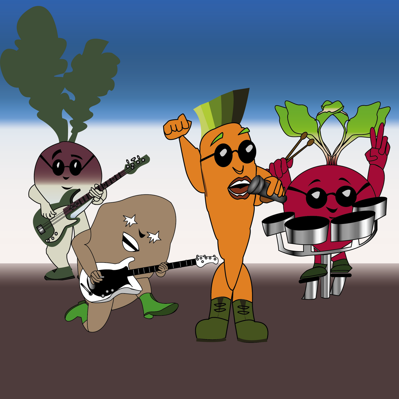
I dropped the four characters I created into a basic layout and realized that adding in the other two characters I had planned would just make things too cramped, so I decided to drop the keyboardist and backup vocalist from the band.  

I didn't really like the background too much, though. It just seemed too empty.  So, I kept playing with it. This is my second attempt. I still wasn't happy with it, though. I placed it into Illustrator and added the band name - The Roots of Rock - as well as an album title - From the Ground Up.  It was looking better, but I still wasn't quite through yet.
I added in the individual root vegetables to fill in the gaps between the empty spaces.  

After I was finished, though, I thought that maybe I should add some squares behind the root vegetables to kind of give them a special emphasis.  

It just ended up making the design too busy.  However, I decided to use that idea to make a coordinating fabric design. Here it is below:


That concludes Project 1: The Spoonflower Root Vegetable Design Contest.


Tuesday, September 27, 2011

Project 1: Stage 2

Carrot top, lead singer for our Roots of Rock concept, is finished.  The execution went smoothly without any unexpected glitches and came out pretty much exactly as I envisioned it.

Rutabaga, our bass guitarist, however, has hit a snag.
The source image I used to create the bass artwork leaves me with space for a thin body, but rutabagas are big and round.  I'll need to either adjust the spacing of the arms or the size of the bass, either of which might throw off the proportions.


Fortunately, after a little playing around with the arm positioning, the Rutabaga is finished and ready to rock.  Next up will be the drummer (beets), the lead guitarist (potato), the backup vocalists (onions), and the keyboardist (radish).

Monday, September 26, 2011

Project 1: Spoonflower Design Contest - Root Vegetables

I love graphic design. I love the process involved in taking an idea and turning it into something tangible, visible, and beautiful.  That's why I have decided to create this blog, to show how a graphic designer takes an idea and turns it into a finished product. This is a behind-the-scenes peek at creativity in action from beginning to end, and hopefully it'll be worth the reading.

I love sewing, for the same reasons that I love graphic design. You start with an idea, and end up with a finished product that is not only beautiful but also practical and meaningful.  You can't love sewing without also loving fabric, and fortunately I have found a place where I can combine all three passions - Spoonflower.  Spoonflower also happens to offer a weekly design contest which in turn provides the perfect venue for demonstrating graphic design work in action.

The current contest is for ditsy prints, but since I've already submitted my contest entry for that, I'm starting this blog with the Root Vegetables contest. The deadline for entry is October 4, 2011.  That gives me one week to come up with a final design.

When I first saw the topic of the contest, I was a bit dismayed. Root vegetables do not exactly make my top list of inspiring things, but that's part of the challenge of being a real graphic designer - finding a way to take a subject and find something in that subject that you can embrace, some creative way to think about it that makes you excited to do the artwork.  After all, if you aren't excited about your finished product you can't honestly expect that anyone else will be either.

I started off by collecting images of root vegetables, preferably with their plant foliage still attached. I was looking for anything that might stand out in terms of color or shape patterns.  The color palette (excluding the plant foliage) is reds, oranges, purples, and whites.  Shapes are rounded rectangles, circles, and triangles. Nothing struck me, or stood out in particular (although as I am writing this I wonder what kind of quilt pattern could be formed from root vegetables shapes).   I decided to try a different direction.

I wrote out the word root. I added an s to the root, for roots.  Roots can mean a lot of things. Roots can be family, roots can be origin or beginning.  Origin, I thought, is the name of a rock band. That's when I started to think about what instrument each root vegetable would play if they were in a rock band.  I chose the carrot as the lead singer. I love carrots, and I don't think there are very many people out there who don't.  I thought of the potato as the drummer, then the rutabaga - the largest of the root vegetables - as the bass guitarist.  Lead guitarist could be the onion - another perennial favorite for those who cook.  Keyboardist could be the turnip, with radishes as back-up vocalists.

With this in mind I made out a rough draft sketch.  As I got to thinking more about it, though, I realized that the beet would make a better drummer (play on the word beat).  

I still have a few other concept ideas that I'll work on sketching out, just to see if any of them turn out better than this concept, but so far it's my favorite.  The other ideas are a block grouping of the root vegetables with their names emblazened beside them; a watercolor-style print of the roots growing below ground (think scientific textbook illustration); and now my quilt idea.

Stage 1 always begins with information gathering and a lot of thinking.  No idea gets turned away in the beginning, as you never know which idea will work out best.  Sometimes a concept proves too complex to pull off in the time frame allotted, sometimes it just doesn't work out the way you'd visualized at first, and sometimes it just doesn't carry the impact you'd like it to have when you finally get it all done.  That's why it's important to have multiple ideas you pursue, so you give yourself (or your client) something to choose from.